Effective fraud detection & investigation: UK’s HM Revenue & Customs testimonial
Analysts and investigators tasked with detecting financial crime typically use a lot of data to uncover patterns of behavior, spot anomalies and reveal suspicious activity.
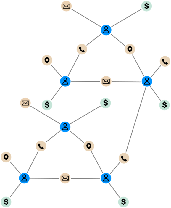
To detect and investigate fraud effectively, investigators need to see connections between accounts, transactions, dates, people, organizations and places. They must also understand complex sequences of events over time. It is often said that fraud detection is a connected data problem.
Investigating financial crime requires a lot of data to be analyzed and it is the perfect task for a graph database and graph visualization tools as complementary assets alongside other techniques to detect fraud.
Using graph modeling, visualization and link analysis
A graph database allows us to bring together many different data sources and graph visualization tools, such as Linkurious Enterprise, help HM Revenue & Customs (HMRC) model relationships between people, places, and financial transactions and express the relatedness of data.
The main advantages we find of graph modeling is rapid development time and flexibility. We can quickly add new functionality without impacting existing deployments and we don’t have to try and squeeze new data into a rigid model so bringing new data to the graph is relatively straightforward.
Link analysis techniques help HMRC analysts and investigators interpret huge volumes of data much faster and so finding fraud becomes a simpler, visual task. It is a lot more intuitive to find patterns that were difficult to uncover in traditional representations such as tables.
Flexible graph visualization options
HMRC uses a number of visualization tools, including Linkurious Enterprise, to visualize entity relationships for a range of large-scale data types.
For some of the largest data sets, it is important to have the simple features offered by Linkurious Enterprise such as icons and colors help differentiate between node (entity) types, while solid and dashed links show the relationships between them.
A useful feature is the ability to add data attributes to charts as labels or to use these attributes as filters. Filtering out data in the visualized view helps to keep the chart tidy and helps our analysts find their answers quickly and ultimately understand our data better.
Being able to group nodes and links by any attribute is helpful to ignore the noise and drill down into what’s worth investigating.
Most visualization tools support multiple layout options to make large datasets easier to interact with and to make sense of their most complex networks. Linkurious Enterprise is no exception and has several useful force direction features to make the analysis intuitive.
Every data set will require a different layout to spread out nodes, reduce link overlaps, reduce clutter, and make multiple connections more explicit.
When dealing with huge, complex networks of connected data, analysts use force direction within the graph to detangle the network to gain visibility of the underlying structure of the connected components of a graph. Force directed layouts position the nodes of a graph chart in two or three dimensional space so that analysts can position and tune the visualization to meet their insight needs.
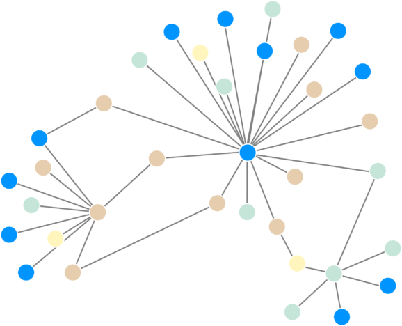
With visualization tools such as Linkurious Enterprise it is possible to tune the force direction to organize nodes in a circular pattern according to connection density. Highly-connected nodes are positioned at the center of the network, whereas nodes with fewer connections are pushed out to the edges. This layout is powerful for discovering key nodes in large networks. The visualizations adapt automatically to items added, changed or removed from the chart. This makes it easy to spot network changes over time.
It’s also possible to structure the layout of the graph visualization to minimize overlaps in the graph by evenly distributing nodes and links and organizing items so that the links are of similar length. This enables an overview of network clusters to make it easier to identify hidden groups.
Displaying tiered data – such as financial relationships - sequentially is extremely useful. This enables analysts to visualize flows from different levels of nodes and explore a mass of data in logical sequential steps. Another benefit is that this supports us in tracking the path of financial transactions through complex networks to provide a clear picture of the path the money took from source to destination.
Linkurious Enterprise also has a number of other features that are extremely useful for this type of work in HMRC. For example, it is possible to implement a complex permissions schema to ensure that only analysts with the appropriate clearance can see certain nodes within a database. This negates the need to create different databases for different user groups. The workflow functionality allows complex cypher-queries and data updates to be served to users as Alerts, which they can then process visually and validate.
Conclusion
Visualization charts can highlight unusual connectivity between entities across multiple datasets and pinpoint connections to be explored in more detail using investigative techniques to understand the behaviors involved and whether or not they conceal a fraud.
A spotlight on graph technology directly in your inbox.