Graph Viz 101: a visual language of node-link diagrams
Graph Viz 101 is a series of posts to teach the basics of graph visualization, written by Sébastien Heymann in collaboration with Bénédicte Le Grand of Université de Paris 1. This is our fifth post, please discuss it below!
In this blog post we introduce the mapping of data to visual representations in node-link diagrams, which are the most common way to represent graphs.
The visual language of node-link diagrams helps to observe global patterns of connectivity (e.g. disconnected groups, structural holes, aggregates of nodes called communities, bridges between communities, cores and peripheries), to spot the presence of unexpected connections and central nodes through visual saliences, and to study trivial correlations between topology and properties of nodes and edges through visual features like color and size. When information is added to node-link diagrams, one generally uses at most five data variables: nodes, node labels, links, a qualitative attribute, and a quantitative attribute. These data variables are usually mapped to visual variables as follows:
Table: Usual mapping between data variables and visual variables in node-link diagrams.
When no qualitative attribute is available, the quantitative attribute can be mapped to dot color as well. Alternatively, one may encode information in the dot border (size and color), and in the node label (size and color). The following figure is a sample visualization of the graph of sales representatives in a private firm. The legend is necessary to explain the visual language applied here, thus allowing us to read and to interpret the underlying data.
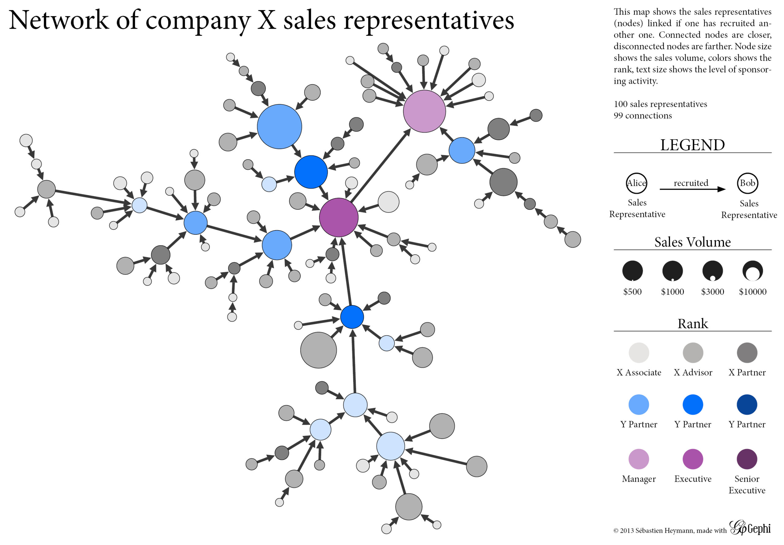
Despite its wide usage among researchers, node-link diagrams are not subject to well-established graphical conventions like those found in geographical maps. One can easily misunderstand them, so the visualization should come with a cautionary text in the legend, stating that:
- Distances are not absolute but relative to local connections. In consequence, one should not compare two graphical distances.
- The representation may be rotated in every direction so the top, bottom, left and right positions have no particular meaning.
- Nodes at the center of the picture may not be central at all in the network.
Geographical conventions may nonetheless influence the design of node-link diagrams. When dealing with multiple data attributes, several authors (see (Boyack 2005) and (Klavans 2009)) distinguish the visual topology made of dots and lines to other visual variables. Like for geographical maps, the topology is then considered as the “base map“, while other variables are added as layers of information. In such cases, these visualizations are called “network maps”. Their comparison is facilitated because node and edge coordinates are the same for all maps. This approach is remarkably used in Scientometric studies (i.e. the study of science as a system), where maps of science represent the way scientific fields relate to each other through publications and co-authorship networks.
We have seen that the exploration of graphs is greatly enhanced by visualization. However when dealing with large graphs of hundred thousands of nodes and edges, reading a static picture is difficult and provides limited insights due to the density of nodes and links. One may want to focus on specific sub-graphs, or to compare maps colored by different attributes, or to filter the graph based on particular rules… Such tasks are supported by interactive features as we will see in the next blog post.
Sébastien
A spotlight on graph technology directly in your inbox.